A recommendation for task background colors
-
I have configured my AppColl Settings to use the task background color codes shown below.
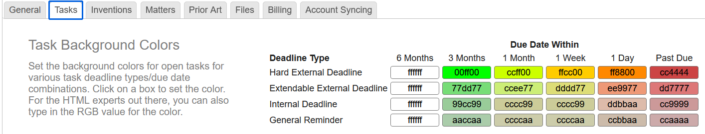
I like that the color indicates how soon the task is due while the brightness indicates how critical the task is.
If anybody else has other recommendations for task background colors, I would be interested. I would be especially interested in any insights from colorblind users.
-
@JonahP1621 I'd like to see some built-in color schemes to choose from with text chosen to display well on the background chosen. Or at least the ability to change both background and text colors.
-
My guess is that fields (columns) associated with tasks are black and fields associated with the matters with which the tasks are associated are grey. Noticeably, Status is an exception because it is grey, even though it is a field related to the task.
While the distinction between fields related to tasks and fields related to the matters associated with tasks is surely meaningful to the AppColl developers, it is unimportant to me. I agree with @RichardS3059 that Task reports would be somewhat more readable if almost all text was black.
Date text is a reasonable exception since the difference of blue or red is a useful indicator of whether a task is due in the future or the past.
-
I like the color scheme and am trying it for my own system. The one problem I have with AppColl's implementation is that the text in some columns is washed out, while other columns, it's very readable.
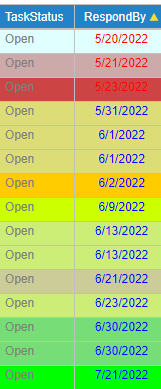 Any ideas on why or how to avoid that problem?